Uncategorized

A DIET COKE ADVENTURE

I found this original magazine spread advertisement and wanted to freshen and brighten it up. I took note of where the hiker was in relationship to the product as well as where the tag line was. This ad is very monotone allowing the product to be the main focus and stand out in the ad. The new ad is much more bright and inviting to the viewer.

Original Ad

New Ad


Complete slideshow


Uncategorized

When isn’t it a good idea to have a second brain?!

Introducing The Happy Planner by Create 365! This planner has both a month at a glance as well as a week at a glance. The days of the week are divided in to 3(!) sections for morning, afternoon and evening as well as a column for notes, lists, or reminders. This planner is also expandable and has additional pages that can be added to it.

Here you will find two different ad’s a total black and white for a magazine spread which is sized at 8.5″ by 11″ and a 150 – 300 resolution and then a partial color ad for a blog post which is sized at 300px by 250px and 72 resolution.

Uncategorized

Anyone getting married?!

Looking for some whimsical wedding icons that you can download an use as a background on invitations, blog posts or thank you cards? I have created just what you need. These cute icons are created using Adobe Illustrator and are available as a transparency which will make a fun background. You will find a wedding ring set, gold heart, 3 tiered cake and gift box all in the popular colors of the season – purple and navy. They are available in 2 sizes – the small version is roughly 1″ x 1″ while the larger size is roughly 5″ x 5″.


Hope you enjoy and find some fun uses for these icons!


Uncategorized

Technical Bits of Photograpy

In this blog post you will see examples of the Rule of Thirds, Depth of Field, and Leading Lines drawn over on professional photos as well as my own amateur photos demonstrating the same aspects. I found the following three photos at http://www.freeimages.com


Photo on the left is original. Photo on the right has a draw over showing where the focus changes in this Depth of Field example.

http://www.freeimages.com/photo/billiard-1-1434097

Photo Credit: Deivida Gailevicus

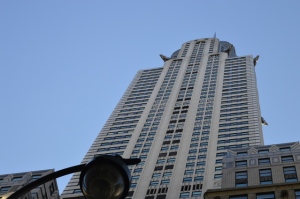
Photo on the left is original while the photo on the right has a draw over accentuating the Leading Lines.

http://www.freeimages.com/photo/chrysler-building-1620428

Photo Credit: Marina Nisi


Photo on the left is original while the photo on the right has a draw over using the Rule of Thirds grid.

http://www.freeimages.com/photo/eucalypt-flower-2-1388434

Photo Credit: Meredith B

Here are the photos I took:

Depth of Field


These photos are an example of Depth of Field. The background is blurred while the soldier is the main focus


These photos are an example of Leading Lines. The pattern of the wood shows nice horizontal patters


This is the Rule of Thirds. As you can see Paw Patrol Marshall fits nicely into the intersection.

While my amateur photos aren’t the prettiest or the best quality, you can see that thinking about how to frame you photo and what elements to use can change the expression of that photo

Uncategorized

Creepy clowns and amusement parks

I found this creepy but fabulous amusement park poster online.

http://matterhorn1959.blogspot.com/2015/08/souvenir-friday-playland-at-park.html

amusement park ad

There is a lot happening in this poster: Graphics, colors, different fonts with different colors. It causes the viewer to not know where to look first or what is the most important information. While there is a fun mix between the Script and the Serif fonts, there is too much of it.